SKII
R E B R A N D I N G _ L O G O _ D E S I G N
P A C K A G E _ D E S I G N
09 / 2 0 2 0
유명 화장품 SK-ll 로고와 패키지 디자인을 재탄생 시켰습니다. SK-ll의 광고와 사용 연령층은 점점 낮아지고 있는 반면, 현재 사용하고 있는 로고는 약간의 올드한 느낌을 감출 수가 없습니다. 이러한 점을 보안하여 기존의 고급스러움을 놓치지 않고 좀더 젊은 느낌의 디자인을 진행해 보았습니다.
We recreated the famous cosmetics SK-ll logo and package design. While SK-ll's advertising and age group are getting lower and lower, the logo currently in use cannot hide a slight old feeling. By securing this point, we tried a younger design without missing out on the existing luxuriousness.
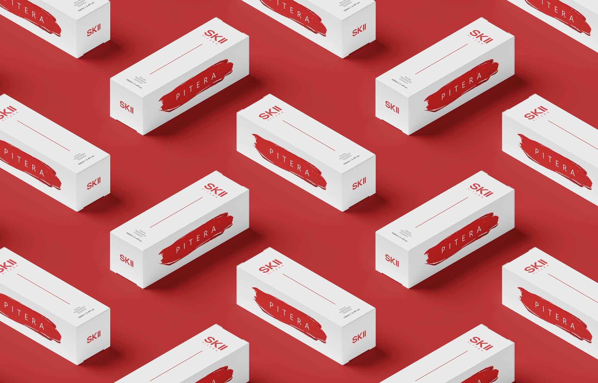
SK-ll의 핵심 원료인 피테라를 로고와 함께 사용하여 강조하였습니다. 그 이유는 대표하는 화장품인 피테라 에센스를 좀더 구체화 시키기 위한 것이 였습니다. 대부분의 화장품들은 원료를 앞세워 광고를 하고 또한, 그 정보들을 바탕으로 화장품을 선택합니다. 기본적인 정보를 알고 사용하면 그 효과는 배가 될것이라 생각합니다.
I emphasized using Pitera, the core raw material of SK-ll, with the logo. The reason was to make the representative cosmetics, Pitera Essence, more concrete. Most cosmetics advertise with raw materials and also choose cosmetics based on the information. If you know and use basic information, the effect will be doubled.