SHAKE:FIT
E X H I B I T I O N _ B O O T H _ D E S I G N
C O U N T E R _ D E S I G N
0 8 / 2 0 2 0
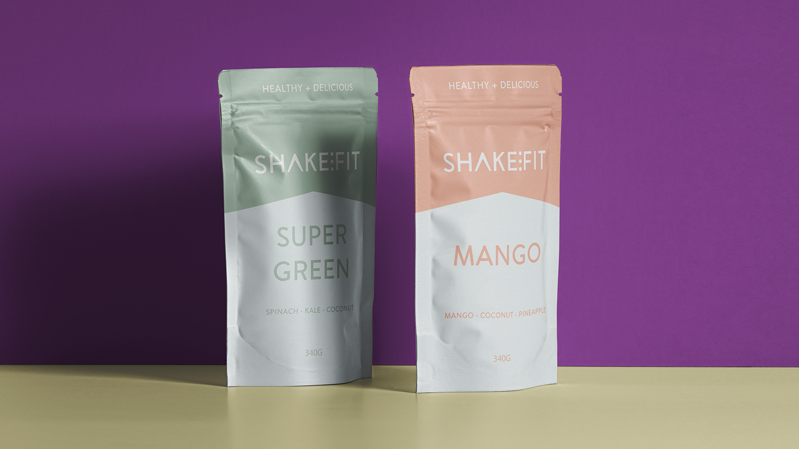
바쁜 현대인의 건강을 보조할 수있는 건강 쉐이크 브랜드입니다. SHAKE:FIT은 남녀노소 불문하고 맛있는 한끼로 대체가능한 건강식입니다. 각각의 맛을 대표하는 식품들의 컬러를 이용하여 패키지를 디자인하였고, 박람회를 위한 부스 디자인과 카운터 디자인들도 같은 컬러로 사용하였습니다. 누구에게나 거부감이 없는 라이트한 컬러를 사용하여 활기참과 건강함을 표현하였습니다.
It is a health shake brand that can support the health of busy modern people. SHAKE: FIT is a healthy alternative meal for men and women of all ages. We designed the package using the colors of the foods representing each taste, and we also used the booth design and counter design for the fair in the same color. I used light colors that are not repulsive to anyone to express vitality and health.

다양한 라이트 컬러로 쉐이크의 맛을 쉽게 알 수있는 SHAKE:FIT 패키지 디자인입니다. 수 많은 부스가 있는 박람회에서도 한눈에 알아볼 수 있겟죠? 포토존으로도 손색이 없습니다. 발랄하고 활기찬 기운을 SHAKE:FIT과 함께하세요.
It is a SHAKE:FIT package design that allows you to easily understand the taste of shakes with various light colors. You can recognize it at a glance at the fair with numerous booths, right? It's a great photo zone. Stay cheerful and energetic with SHAKE:FIT.